
UX/UI Design for XR Devices in Mixed Reality
Headset interfaces follow different rules than screens — comfort zones, real depth, rays instead of cursors. An analysis of XR UIs from Magic Leap to Meta.

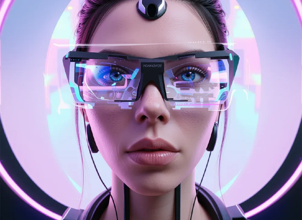
Over the years, several mixed and extended reality devices have emerged with very different interfaces. In this post, I examine the design variations and the composition of the different XR interfaces in detail — the designers behind them are linked in the sources section.
The post is split in two: a fundamentals section on comfort zones and depth layering — the toolkit for reading the GUI implementations analytically — followed by the device-specific sections on Magic Leap and Meta. The text dates back to 2023; at the end I assess what still holds up in 2026.
Integrating the Real World with Passthrough
Integrating virtual content into the real world — that's exactly what the concept of mixed reality is about. It was a long-standing goal in virtual reality too, but there was no real visual representation of the physical world. The extended screen space of a VR headset only becomes truly interesting once augmented reality comes into play.
New Possibilities for Spatial Awareness
One of the key benefits of XR devices is their ability to blend the physical and digital worlds — a level of spatial awareness that's impossible with traditional screens. Passthrough lets users see the real world through their device, making it easier to interact with the environment and with other people. Especially in gaming, this enables interactive experiences that draw directly on these capabilities.
XR Apps for Productivity
Beyond gaming, XR devices also work for productivity: with passthrough, users can work in mixed reality and access digital information and tools in real time — without switching between screens. Especially useful for tasks requiring hands-free interaction: drawing, design, navigation.
XR Devices as a Monitor Replacement
XR devices can replace traditional monitors and offer a more immersive, interactive working environment. Placing digital information directly in the physical world helps maintain focus.
Trying Out the UX of Working in Mixed Reality
The combination of passthrough and XR hardware enables a way of working where digital content sits naturally and intuitively in space. A pragmatic experiment worth trying: pair a Bluetooth keyboard with the headset (works well with Meta devices), switch to desk mode, and launch the built-in browser.
Getting Started — and What About Rules?
For interaction, adopting positions that are as comfortable as possible has proven effective. Depending on the interaction medium, a different position may be more comfortable.
Understand the Canvas and Respect the Depth
The canvas in XR is defined on the one hand by human perception — the zoning principle — and on the other by the physical space and the objects within it. The idea of content areas is based on ergonomics and display characteristics: where things should be placed.
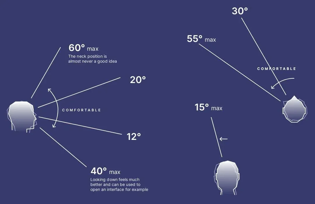
Head rotation is only comfortable within a certain range (diagrams: Mike Alger's "VR Interface Design Pre-Visualization Methods"). The areas of comfortable and maximum rotation yield useful zones for placing content in non-rotating experiences.
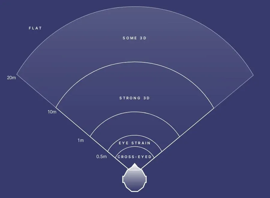
The stage is the area where the head can rotate comfortably and objects still provide stereoscopic depth perception — closer objects create a more distinct sense of "3D optics".
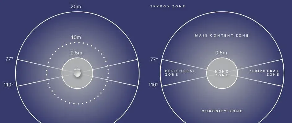
- Peripheral area — visible at maximum head rotation. Still perceived regularly, but no long-term content should be placed here.
- Curiosity zone — at this point users literally turn their shoulders and strain to look behind themselves, usually to satisfy curiosity about their surroundings.
- No-no zone — as content approaches the face, eyes squint and strain. Nothing should be displayed within this radius around the head. The commonly cited 0.5 m is rather generous in practice — better read as a soft fall-off zone without a hard line.
- Skybox zone — beyond roughly 20 m, both screens show essentially the same image pixel for pixel; depth perception is gone. To cut rendering costs, objects beyond that are flattened into a spherical texture surrounding the user: the skybox.
With this basic XR-UX/UI knowledge, the placement of buttons, sliders and interfaces becomes a conscious, well-planned design decision.
Magic Leap — Lumin OS
Lumin OS, Magic Leap's spatial operating system, enabled advanced 3D visualization workflows, enterprise device management, multi-user functionality, and voice and gesture control. I listed the associated tools developed by the company in my post on the evolution of XR in 2022.
https://www.youtube.com/watch?v=FdYwV7UC7lI
Magic Leap 2 — Human-Centered Design
A custom typeface designed specifically for the device, applied consistently across the entire GUI. How far is the effort of UI implementation worth it — and does it really need its own typeface? In my view, it's a question of purpose. Impressive how consistently it was executed — down to the last icon for the home button on the controller.
For UI design, that's the foundation. If your own content is meant to stand out and offer a different layer, my recommendation: be edgy and organic at the same time.
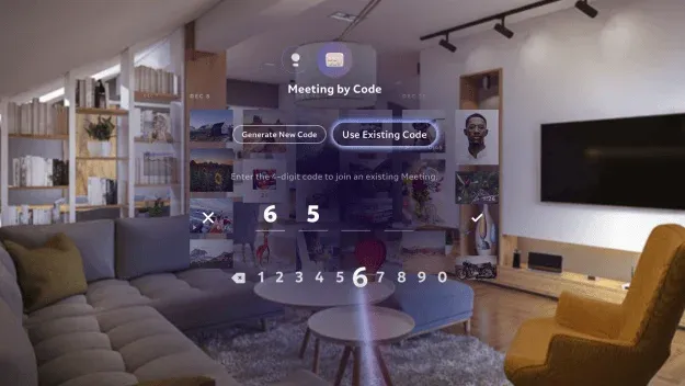
The pointer interaction beam navigates through the GUI using the controller's orientation — a spatial cursor that shoots a ray into the 3D scene. This interaction helper can be found in almost every XR UI and is also part of hand- and gesture-based interaction: by now a standard XR-UX feature.
Sliders and simple but effective UX are needed to navigate application content. My recommendation: bright colors and strong contrast — readability improves noticeably. On depth, don't go too far along the Z-axis toward the user; playing with layer depth is tempting, but a realistic distance looks better. 2D content placed in 3D space quickly looks pasted-on — especially when it isn't facing the user.
Spatial UX/UI by Magic Leap
https://www.youtube.com/watch?v=0Lo_0RC-F4Q
Magic Leap World Update in Lumin OS 0.98.10
Since Lumin OS and the Magic Leap UI were designed from the ground up as an augmented/mixed reality interface, this implementation remains an excellent mixed reality experience to this day.
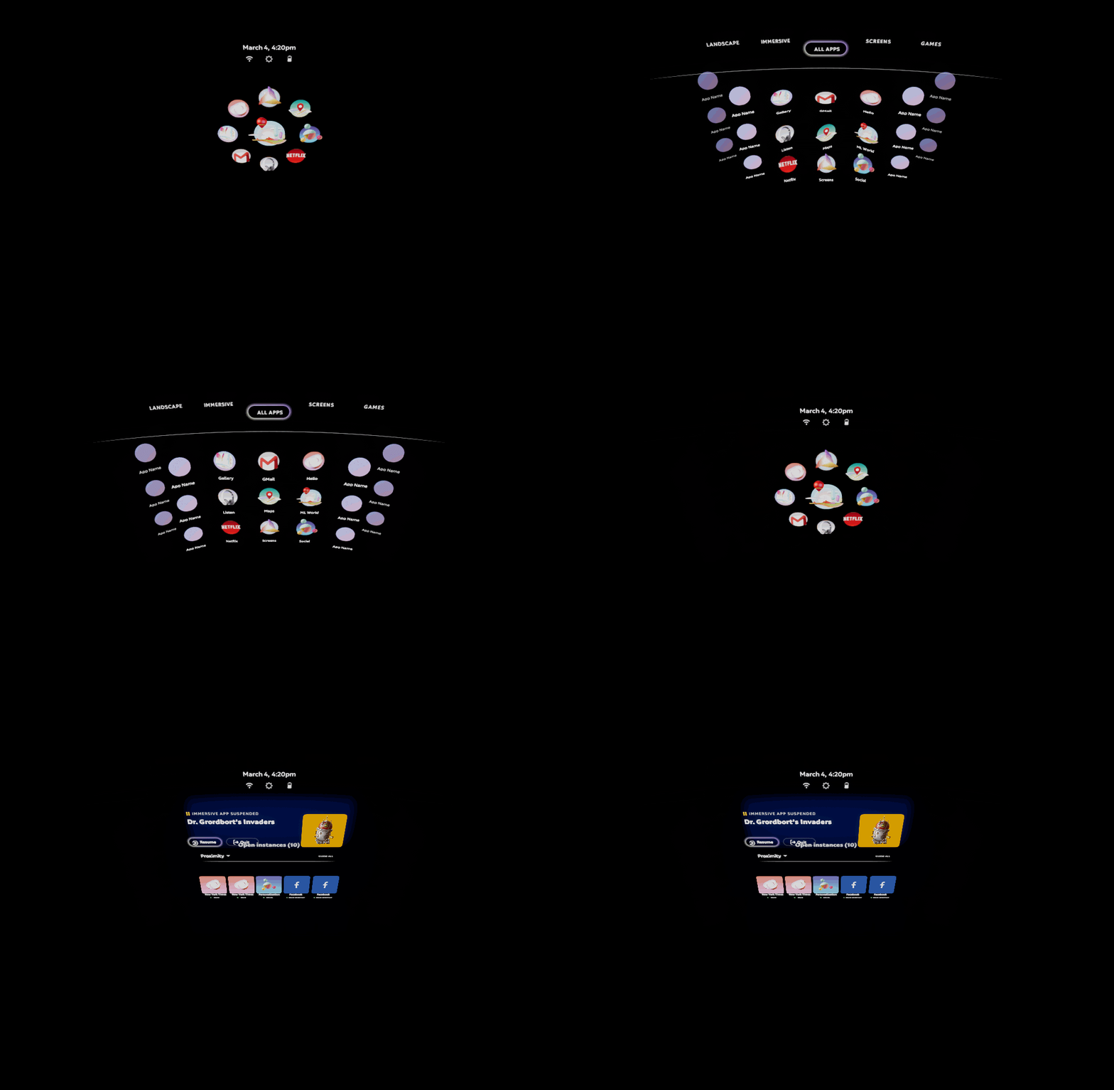
Magic Leap's GUI
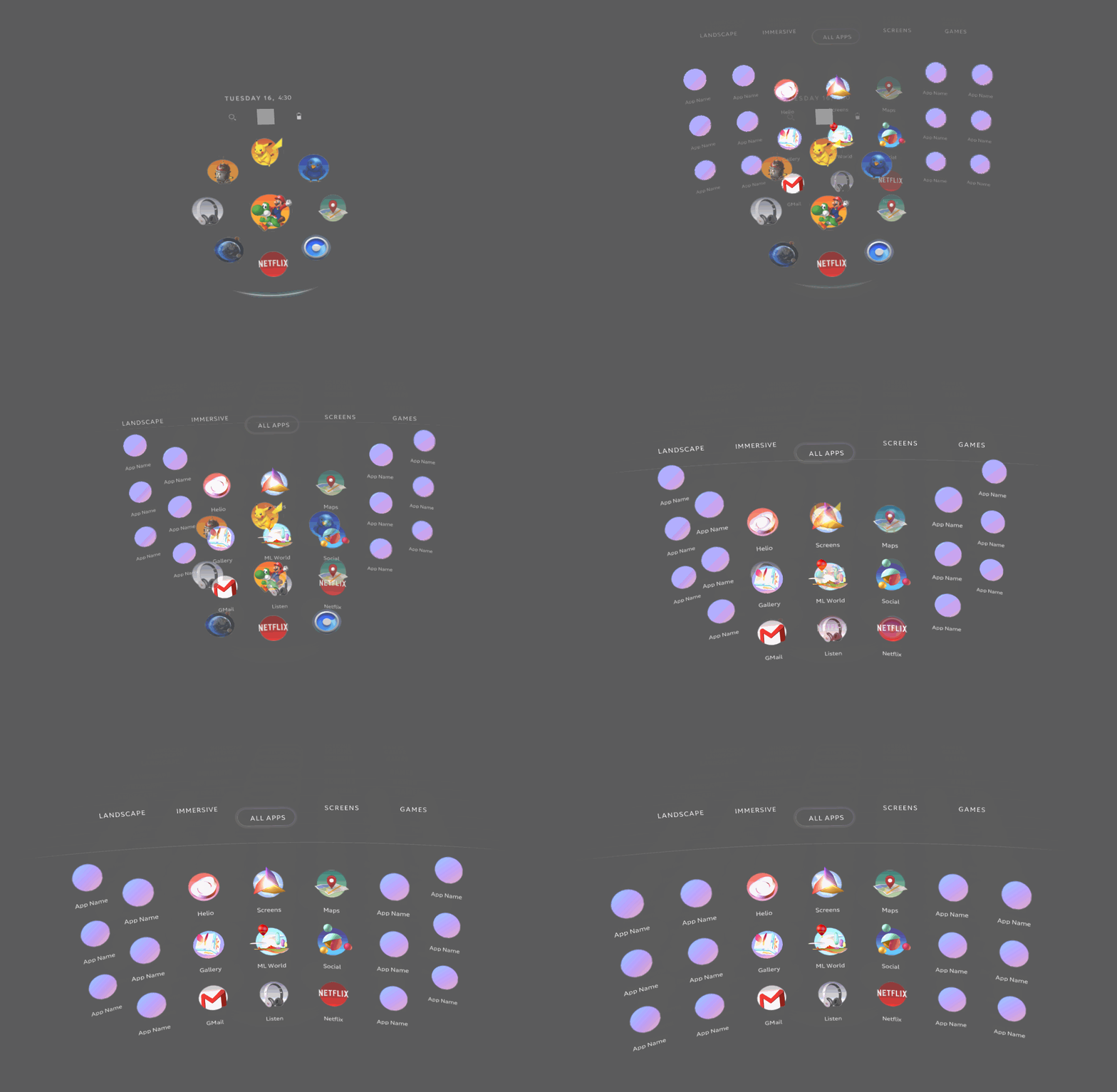
Magic Leap's application launcher
The spatial 2D/3D interface animations are particularly unique — it's exciting how consistently the circular shape was executed. The takeaway: think in motion. When the UI responds to the cursor hover, it automatically feels responsive and invites interaction. The launcher's arrangement and its adaptation to the controller make a balanced, well-placed impression.
Meta
With the Meta Quest Pro's high-resolution color passthrough, a new era of spatial UI began at Meta. The ability to identify room surfaces and anchor virtual objects to the physical world is impressive.
XR Productivity Apps
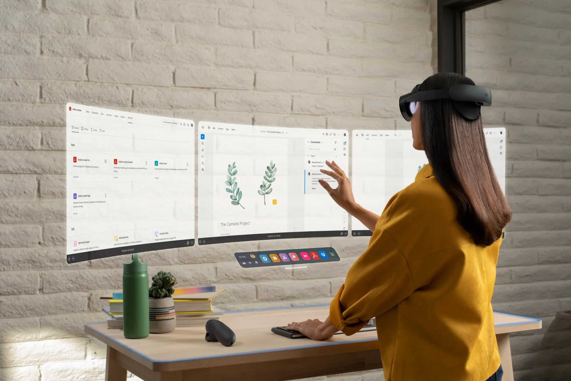
Adobe Acrobat Pro in Mixed Reality
The Quest Pro enables — as shown in the promotional image — easy access to PDFs in VR or mixed reality via Adobe Acrobat Pro as a productivity application. The promotion shows the application "standing" — which looks good but isn't the standard position: PDFs mostly arrive via email or from the browser and sit in the background, on a second monitor or in a tab. That's exactly why the 2D overlay feature shown below works so well in combination. Though it raises the question of why the browser wouldn't simply suffice for PDFs. Still: the app ships UX/UI details that work surprisingly well and serve as a source of inspiration.
2D Overlay Design for XR
Greg Madison's post shows the 2D overlay feature — very handy, e.g. for pinning an extra browser window inside an application or for multitasking.
It's precisely these plain features — the ones everyone uses as a matter of course — that will be expected next: shortcuts and the integration of everyday work tools such as PDF and office applications, email, chat — the core components of daily work.
9/ 2D App Overlay: Like in the physical world with our phones, you want easy access to the web wherever you are in the metaverse — not just in VR Home. New for Meta Quest Pro, users will be able to open up the browser or any other 2D app without leaving the VR app they're in.
— Jacob Rossi (@jacobrossi), October 11, 2022
Meta's XR UI Experience
From a user perspective, GUI design for XR devices was a new world back then: the features Meta developed opened up exciting possibilities but were barely used — built more for a possible future.
The implementation mixes already-proven principles — from Microsoft and others. Very coherently executed: the "dock", or rather the taskbar; though features like pinning apps and further customization were still missing for the behavior users expected.
Excellently implemented, however — and a genuinely strong concept — is the responsive scaling of windows: it solves the size problem directly and lets users adjust the interface as desired.
The review video Meta Quest Pro — For Creatives, UX/UI and Spatial Designers shows weaknesses alongside the strengths: resolution in particular requires real sacrifices. It becomes clear that a closed headset only shows the world through mounted cameras — not exactly a positive effect compared to "real" AR glasses. It makes sense to use human vision rather than imitate it.
Assessment 2026 — What Still Holds Up
Three years on, the hardware landscape has shifted considerably — while the design principles from the fundamentals section have become quasi industry standard:
- Meta: The Quest Pro was discontinued at the end of 2024; today's lineup consists of Quest 3 and 3S. The system is now called Horizon OS, is open to third-party manufacturers, and is getting a new UI layer called "Navigator" that replaces the old Universal Menu — some of the gaps criticized here (pinning, customization) have since been closed.
- Magic Leap: Lumin OS is legacy. Magic Leap has transformed from a device maker into an optics and platform partner, developing Android XR reference designs with Google — the partnership was extended by three years in October 2025. The launcher aesthetics remain a reference point for spatial UI regardless.
- New benchmarks: Apple Vision Pro with visionOS (2024) and Samsung Galaxy XR with Android XR (2025) have formalized the fundamentals described here. Apple's Human Interface Guidelines codify exactly that: center content in the field of view, never pin anything rigidly to the headset, generous touch targets, windows/volumes/immersive spaces as placement logic.
- Further reading: For the cross-platform structures behind this — and why some interfaces fail on motion sickness — see the analysis in my post on spatial UI.
Sources
- VR Interface Design Pre-Visualization Methods — Mike Alger (2015), basis of the comfort zone diagrams, mikealger.com
- Alex Chu on Designing Milk VR — Voices of VR #117, Kent Bye (2015); context on Chu's SDC talk "VR Design: Transitioning from a 2D to a 3D Design Paradigm" (2014)
- Sean Couture — Lead / Senior 3D Artist, launcher animations
- Greg Madison — Experience Designer @Meta, 2D overlay demo
- Jacob Rossi — 2D app overlay thread — Meta (2022)
- StartUX — YouTube channel by Avi Barel
- Human Interface Guidelines: Spatial Layout — Apple
- Magic Leap extends Google partnership for Android XR — Magic Leap Newsroom (2025)
- Quest Pro officially discontinued — UploadVR (2025)
The interfaces and images shown are subject to the rights of the respective publishers; this post serves analysis and information purposes.
An XR or spatial design project on the table that needs to become decidable? Then a conversation is worthwhile → ingmar@konnow.de · LinkedIn